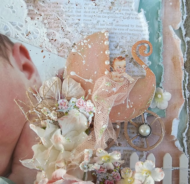
Hello Everyone, I'm here today to share with you another layout I've created! This one is super special because it's my only niece and I just really adore her! On this layout, I used Prima Marketing's Heaven Sent Collection, which I absolutely adore. It has such a soft and sweet color palette.
As usual once I had all my goodies chosen for my layout, I began with layering my papers to get the perfect look for my page. Once I felt I had everything the way I liked it I distressed everything using my Invild Bolme Distress Tool. I love peeling back the edges of the paper to reveal another coordinating sheet behind the top, I think it gives it an extra tattered and worn look!
Once my distressing was complete, I began working on my chipboard stroller (I'm very sorry, I bought this from my LSS years ago unlabeled in a clear baggie, so I am really unsure of the manufacturer). I started out by giving it a light coat of gesso and letting it dry before I used lunminarte water colors to paint it. I then used some distress ink and stickles around the edges to give it a weathered aged look. I finished it off by adding some Flourish with a Bling pearls to the canopy and one for the wheel. I wanted to incorporate more of the paper collection so I used some Websters Pages lace netting to create a flowing blanket from the stroller with a baby cut from the Heaven Sent Collection peeking from the stroller. While I love the look of my chipboard embellishment, I do confess that if I could change one thing, I'd have covered it before I did splatterings of the white acrylic paint......oh well.
Moving on I started layering my embellishments which included a mixed array of left over Prima Florals , a fence I found in the crafting section at Hobby Lobby and more bits and pieces I fussy cut from the paper collection. I weaved pieces of burlap and baby's breath throughout my floras before adding finishing touches with some pearl centers. I wanted the tails to my bow to remain big, so I used a hot glue gun to give it a crinkled look. I actually have an older TUTORIAL HERE using this same technique.
To finish off my layout I used some distress in and a makeup brush to help it look a bit more aged, I then did some splatterings of white and brown acrylic paints, before white washing everything with acrylic paints as well. I added some last minute finishing touches with some stickles in various places thru out my page for some sparkle!
Oh I actually almost left out my favorite part!!! The feather headband! I actually didn't take this picture it was given to me and the top of her head was a bit chopped off.....I felt like I could never quite get it to look right so I decided to create an illusion of a full head by adding a headband. I simply used some lace , a feather and a pearl.....very simple! I finished it off by adding some stickles down the center of the feather.
I hope liked my layout and found this post useful, if you have any question feel free to email me at cj7evans@yahoo.com. I love reading your comments so let me know what you think! Also I have more layouts coming soon, so please check back for details on those as well!


No comments:
Post a Comment