Tuesday, November 29, 2016

Prima November Build a Page

Hello everyone, thank you for stopping by!
I hope your all staying warm and that all my US scrappy friends had a wonderful Thanksgiving!
I definitely did, and I have so much to be thankful for, I am truly blessed.
 
 
Today I want to share with you a layout I created for the Prima Build a Page Challenge .
I have to admit the sketch is like no other layout I have created before so it really helped me to step outside of my comfort zone and get creative.
 
2016 november bap


This is my take on the sketch


The phot in this layout is from my oldest daughters senior photo shoot (gosh that just never gets any easier to say either).
 
For the background paper I used Prima's Tales of You and Me collection. I thought it looked great with the bit of Rossibelle collection I had left over. The rossibelle collection has so much yummy things I was able to fussy cut,,,,,it might seriously be one of my most favorite prima collections EVER!!!


So I wanted to try something a bit different for this layout, instead of using paper in the corners, I used chunky glitter and a bird cage cut from the Rossibelle Collection instead. +
 
The chipboard feathers are from 2Crafty. I used some old texture powder in two different shades (I'm sorry, the LSS I used to shop from occasionally sold things in smaller tins, unlabeled, so I do not have a brand or a color to share with you.
 
 
I wanted to created some different textures and medium so after applying some soft, coordinating shades of water colors, I used some micro beads as well as some more chunky glitter and some pearl adhesives from Flourish with a Bling.
 
I hope you enjoyed my layout and was able to find some inspiration for your own creations!!!
 
Thanks again for visiting, I love hearing what you have to say, so leave me a comment and if you have further questions please send me an email or find me on Facebook.


More Than Words Challenge

Hello everyone, thank you for stopping by!!

I hope everyone is enjoying this holiday season, I just love this time of year....the lights, the sweet smells, the goodies, and the magical wonder!!

So I have a layout to share with you today that I created for
More Than Words Challenge Blog

I have never played along with this challenge before, so I am super excited to give it a shot this month....plus it gave me an excuse to use some Maja Design papers I have been drooling over!

The challenge this month:

Word Inspiration - SPECIAL
Creative Challenge - OUR QUOTE


I decided to use this challenge as inspiration to do a layout using a photo from my daughters senior photo shoot.


For the creative challenge I did the following on my layout:

OLD: lace (the lace was left over from an old Scrap That Kit I'd received years ago)
NEW: Maja Designs Summertime Collection (new to me, I recently received my package)
BORROWED: glimmer mist (I borrowed glimmer mist from another scrappy friend of mine)
BLUE: handmade flowers

For the word inspiration 'SPECIAL', I freehanded it on the upper left corner journaling tab, because this day was a very special day to both my daughter and myself as we'd been planning these photos for a while.....and the meaning behind them carries very much sentiment....it's a symbolism of closing one door, while opening another...and this is a very special time, so it I felt it was very befitting for this layout!


I used Maja Designs Summertime Collection, which is absolutely stunning by the way! You know when you get those patterned papers where you see the first side and fall in love with it only to flip it over and love the other side equally and then realize you only order ONE piece and not multiple!!! Yea....that was definitely this collection for me....I really did not get enough and will be going back for seconds!

As you can see, I did a lot of layering and paper distressing...I love the weathered shabby chic look it produces.

The blue flowers are handmade and the white ones are older Prima blooms. Rhe chipboard is an older one, I believe it's from Fabscraps.


I used some acrylic paints and glimmer mist to create some splatterings as well as some drips. I also used the white acrylic paint to give everything a quick white wash, which is another go to technique you will see in a lot of my work.


I hope you enjoyed checking out my layout as much as I did creating it!
As always that you for stopping by and I hope I have given you some inspiration to create!
I love hearing what you guys have to say, so leave me a comment or send me an email or find me on facebook if you have any questions!


Saturday, November 19, 2016

Guest Design Invite!!

Hello everyone, I hope all is well and that your getting excited for turkey day!!
 
I have some seriously exciting news to share with you!!
I have been invited for a 4 month
Guest Design Spot
on the
Design Team
 
 
I have admired Pam and her Designers over the years and to be asked to create using her beautiful kits is truly a dream come true!
 
I look forward to showing you all what can be done with these amazing kits and I want to personally invite you to sign up for yours today. For further details please visit
 
Thanks for stopping by!

Tuesday, November 15, 2016

CUTE

Hello everyone, thanks for stopping by! I hope you are all enjoying this gorgeous fall weather we are being blessed with, I definitely am loving it, as in my neck of the woods it's not too hot and not too cold.
 
Today I have a layout of my youngest daughter using some more gorgeousness from Lemoncraft;s Neverending Summer Collection....guys if you have not had the opportunity to get yourself some of this collection, I'm definitely here to let you know you are missing out....my only regret with this beautiful paper is that I did not order enough!!
 
 
As After I had all my goodies picked out for my layout, I began by layering my page until I achieved the look I desired. I cut a few of the journaling pages from this collection to add to my layout. I then used my Invild Bolme Distress Tool to distress and tatter up the edges to give it a aged, weathered look. I also used some coordinating paper behind my main layout page so that I could peel back edges and expose the coordinating papers. I love doing this as it just seems to add dimension as well as increased that weather and tattered look I so very much love.

 
Once I was done distressing and peeling back my papers, I wanted to get my chipboard
(Spring Flower Bunches By 2Crafty)
prepared. Guys, I loved this technique I used and I promise to prepare a tutorial soon, as I will be using it again in the near future! So I started by using a sponge dobber to give my chipboard a light coat of gesso. I then used light pink acrylic paint over the entire chipboard. I then used a very fine tipped paint brush dipped into a bit of a darker pink ink pad and gently brushed 2/3 up each flower once the acrylic paint had dried. I went back over the bottom third with the same fine tipped paint brush and an even darker pink to give it an ombre look. I really wanted the chipboard to be special and pop, so I brushed the top edge of each flower with some iridescent stickles for some added sparkle!

  
I wanted to add a bit of glimmer mist, but I wanted it to be a bit softer, more like a water color pattern so I added a bit few drips of the mist into a paint tray along with a few drops of water before using a large dobber to add it the mixture at the top left corner and lower right corner where the photo will be placed. I allowed for some of the paint to drip down the page. I wanted to add more media, so I also used acrylic paint include some paint splatterings as well as paint rings using the lid to the acrylic paint.
 
Once everything was nice and dry, I started to adhere my layers and added some light blue netting I had left over from an older Websters Pages collection beneath my flower clusters. I finished off my layout by giving everything a white wash with white acrylic paint and adding a few micro beads on a few of the flowers as well at the top right of the page.

 
Thanks for taking a look, I hope you enjoyed my page and are inspired to create!! I love reading your comments, so please let me know what you think! More pages coming soon, so be sure to follow my blog, facebook page or subscribe by email so that you can be updated when I add a new post! 

Monday, November 14, 2016

Lemoncraft's Latest Collection!!

Hello everyone, thanks for taking the time to stop by, I hope you are all enjoying this gorgeous fall weather, I know I sure am!
I wanted to share with you today a brand new collection from
as well as a new and improved version of an older collection
 
https://lemoncraft.pl/shop/pl/116-kolekcja-sercem-malowane
 
I want extend their invitation to their RETAIL STORE, where you can purchase both of these exquisite collections!! As a Lemoncraft Consumer, I can affirm that you will not be disappointed with the beautiful elegance of their products!!


Friday, November 11, 2016

Beauty

Hello Everyone, it seems I have had a bit of free time on my hands and I actually have another layout to share with you today!


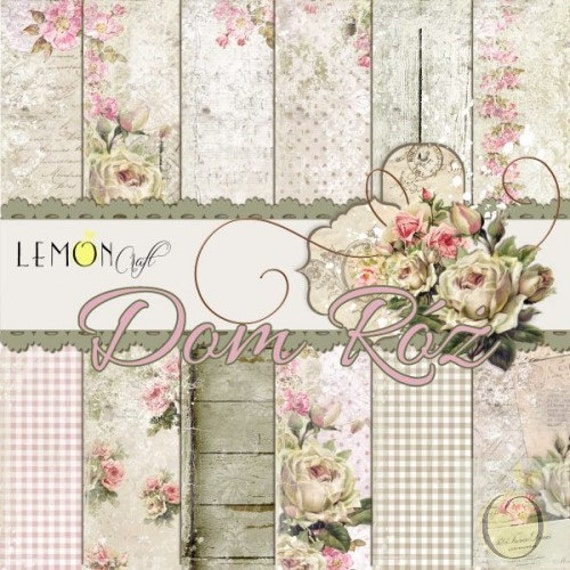
I am so excited about this layout as I just LOVE LOVE LOVE the House of Roses paper collection from Lemoncraft, it is completely gorgeous!

 
I could not wait to great creative when I received my new Lemoncraft goodies!
 
This is a layout using a photo from my oldest daughters senior photo session (my where has the time gone)! The House Of Roses collection paired wonderfully with the photo and allowed my to create that vintage shabby chic look I was going for. As always once I had all my supplies selected and scattered about my desk for my layout, I began layering and distressing using my Ingvild Bolme distress tool. I added coordinating paper behind the layout so that I could peel back the paper and expose the coordinating paper. I love doing this because it not only adds dimension, but also it gives it a more tattered and weathered look which you will see in all my creations as that is a favorite technique of mine!
 
When I received this collection one thing I knew I wanted to do right away was cut the wood patterned paper into strips to make it look more like individual weathered barn wood. I cut them into different lengths and shapes at the end to look more realistic as old barn wood varies in shapes and sizes. I them used my Ingvild Bolme edger ink in dry sand to ink the edges to make them stand out more.

 
I loved all the floral patterns to the paper and wanted to incorporate as much as I could to my layout, so I also fussy cut some roses to include at the edges of my layering. Lastly I added a random white picket fence I had in my stash, along with some random Prima roses I also had in my leftover stash. I finished off the florals with a leaf flourish stamp from heartfelt creations.


Once I felt my layout was complete, I used my Tim Holtz Distress Ink in Tattered Rose with a sponge to lightly ink around my layers to add dimension as well as give it a distressed, aged look. Finally I used some white acrylic paint to white wash over my layers and florals to give it a muted toned down look.


Thank you for looking, if you have any questions please email me at cj7evans@yahoo.com. I love reading your comments, so please let me know what you think, I hope my layout was helpful and you were able to find some inspiration for your own creation!

Blue Fern Studios November Challnge

Hello everyone, I have a layout I  created for Blue Fern Studios November Challenge to share with you today. This months challenge was to create something using a Blue Fen Studios chipboard title. I chose to use the title 'Discover'


This is a layout of my youngest son from a few years back, taken at the zoo. When I received my order of Blue Fern Studios Frolic collection, I was stoked to see how well this photo looked with the paper and couldn't wait to get creative!!
 
As usual once I had all my goodies chosen for my layout, I began with layering my papers to get the perfect look for my page. I decided to tear a piece off the side and flip it around to expose the coordinating paper of the other side. I just love the rich color palette here. Once I felt I had everything the way I liked it I distressed everything using my Invild Bolme Distress Tool. I love peeling back the edges of the paper to reveal another coordinating sheet behind the top, I think it gives it an extra tattered and worn look!
 
I then began to work on my chipboards, which also included 2 small Blue Fern Studios Symphony Corners.  On the title I used Prima's gesso as a basecoat before I created my distressed ombre title. Using acrylic paints, I first painted the chipboard in a lighter shade before using a sponge dobber to ink the 2/3 of the bottom half of the chipboard with Tim Holtz Distress Ink in Vintage Photo. on the bottom third I did the same but instead using Black Soot Distress Ink. I used the same colors for the corner chipboard, but instead of making an ombre title, I gave them a faux rusted and weathered look.


I wanted to add a bit of mixed media to my page which I did by using a TCW stencil and some homemade texture paste, I also used acrylic paint to create some splatterings and cicle imprints using the lid of my acrylic paints as a stamp. In addition I used A Prima stamp and vintage photo distress ink to do some random stamping throughout the page. Once my page was distress and ready I began adhering the layers and flowers before giving everything a quick white wash with white acrylic paint.
 
Thanks for looking, I hope you enjoyed!  


Tuesday, November 1, 2016

Sweet

Hello everyone, I hope everyone is having as beautiful weather as we are here today, this Indian Summer is awesome and feels amazing! It sure makes outdoor activities quite enjoyable, and with the leaves slowly starting to change, I have the most beautiful view from my scrap room. It's such a cozy spot!!

I have another layout to share with you today using Prima's Rossibelle Collection. This paper is quite gorgeous and the bright colors and foils are quite stunning! I had a lot of fun creating with this paper.....my only regret is I did not purchase much of it to begin with and will need to order more as I just really loved it! This layout is a photo of my youngest daughter, she is such a sweet lil thing and was most definitely my muse for this layout!

 
I always start my layouts by collecting my supplies....Which is quite a process. I have everything separated by like kind. so what I tend to do is go thru each section such as ribbon, stamps, bling, chipboard, ect. and grab what I think I might use on my layout.....so by the time I'm done shopping thru my supplies for goodies to go on my page....my desk is full. The funny thing is, I usually only use 60-70% of what I drag out, thus leaving me to put away the excess supplies I dragged out. I'd love to hear how you guys go about collecting supplies for your pages....do you make a mess like me or do you know exactly what you want prior to starting??
 
After collecting my supplies, I began by layering coordinating papers and doilies behind my photos until I achieved the look I was going for. I then distressed all my papers using my Invild Bolme Distress tool, I like to peel back random edges of the papers to show coordinating papers beneath, like I mentioned yesterday, I think it gives it a real aged, weathered look!
 
 
Once all my layering and distressing was complete, I began working on my chipboard which I believe is from Imaginarium. At first I used acrylic paints to paint the frame a copper color to help pull out the beautiful copper colored foils splashed about the paper, but, it never quite looked right to me.....I think it may have 'popped' almost too much so I used some gesso and white acrylic paint to give it a softer look and instead used some copper colored Flourish with a Bling pearls around the edges of the frame.
 
 
For my next chipboard (sorry, unsure of the brand I bought it years ago from my LSS in an unmarked baggie), I decided to use the copper colors to pull out the copper color foils on the paper. I first used copper acrylic paint then used some stickles thickly over the whole chipboard to give it some sparkle.

Once I finished my chipboards, I set them aside to dry and began fussy cutting some flowers, butterflies and a tag from an extra page with the same print. I tucked the flowers throughout the Prima flowers. I also cut out the tag from the mid upper left side since my photo covered the original one and placed it atop where it should be and my photo using pop dots for a dimensional look. I added a hemp cord bow as well as a butterfly cut and stickled from this collection.


I then added a bow using a technique I've love doing....you can find an older tutorial of mine HERE. I also used some leaves I made from using a Heartfelt Creations Stamp. I also intertwined a bit of cheeseclothe here and there to give some added textures and dimension. I finished off my layout by giving everything a light coating of white wash using acrylic paint as well as some splatterings also done with acrylic paint.

I hope you liked my layout and found my post helpful, if you have any questions you can email me at cj7evans@yahoo.com. I love reading your comments so let me know what you think. I'm looking forward to adding some more creations sometime next week, so stay tuned!